Summary
The Team's Summary tab two view that can be toggled. The default Team's Summary tab displays the dashboard that provides summarization of team's performance. To view details of the summary, use the toggle button to change the view. It shows each team member’s EQ in table format.
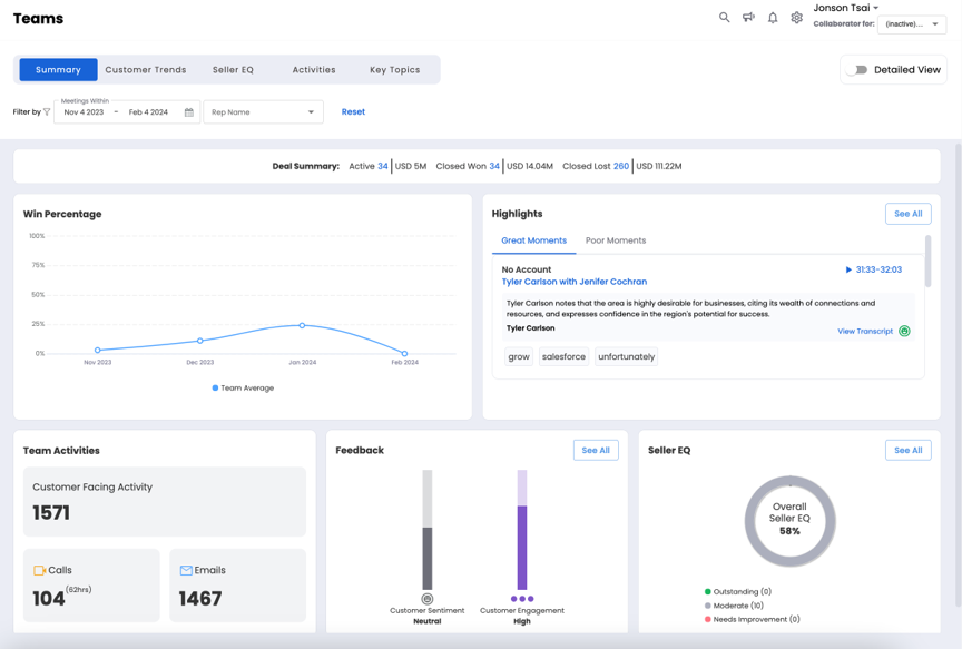
Dashboard View
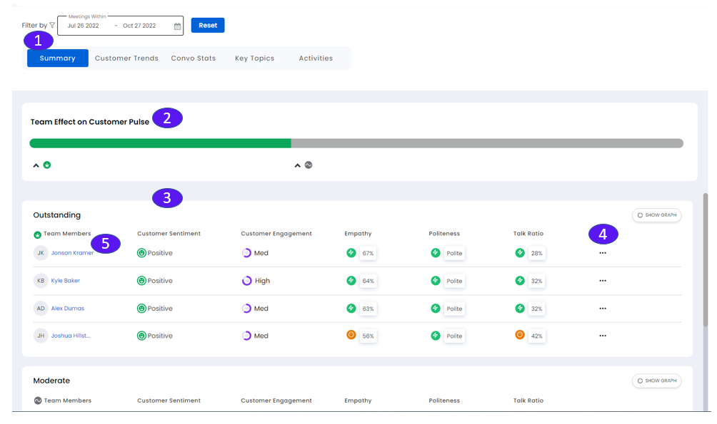
List View
1. Filter by
Filter over a date range. Reset will return to default settings.
2. Team Effect on Customer Pulse (Color Bar)
Shows EQ level for all members as High, Moderate, or Low. Use Show/Hide to show or hide the EQ level in the table.
3. Team Effect on Customer Pulse (Table)
Shows the EQ of reps, grouped in sections from High to Low and ranked within the sections (highest to lowest). On the top right corner of the group the Show Graph/Show Table toggle switch can be used to toggle between the graphical or tabular views.
Team Members name and icon.
Customer sentiment (Positive-Neutral-Negative) achieved by this rep during the sales conversation.
Customer engagement (High-Medium-Low) achieved by this rep during the sales conversation.
Rep’s Empathy.
Rep’s Politeness.
Rep’s Talk Ratio.
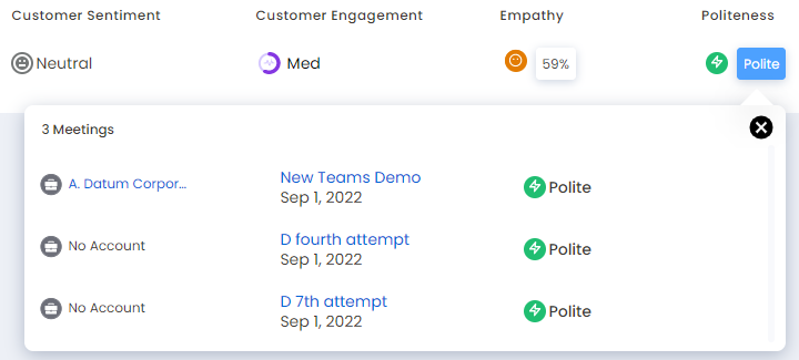
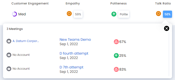
You can also sort the result of this table by those column headers. Click on an EQ value to see detailed information.
4. Team Effect on Customer Pulse: Add Comment
Managers can add comments by clicking the horizontal ellipsis (…) at the end of the row. Comments show up on the Improve page under Observations.
5. Individual sales rep's icon
Click a rep’s icon to go to a page that shows Improve Insights. See Improve EQ.