Chat Widget Configuration
The Chat Widget lets you add an AI-powered chat experience to your website with a simple embed script. Once you configure the widget, generate a token, and add the provided script snippet to your website, the widget is automatically embedded, and visitors can interact with the configured AI agent directly from your site.
You can also configure the widget's branding, allowed domains, and display mode. The widget supports the following display modes:
Access Chat Widget
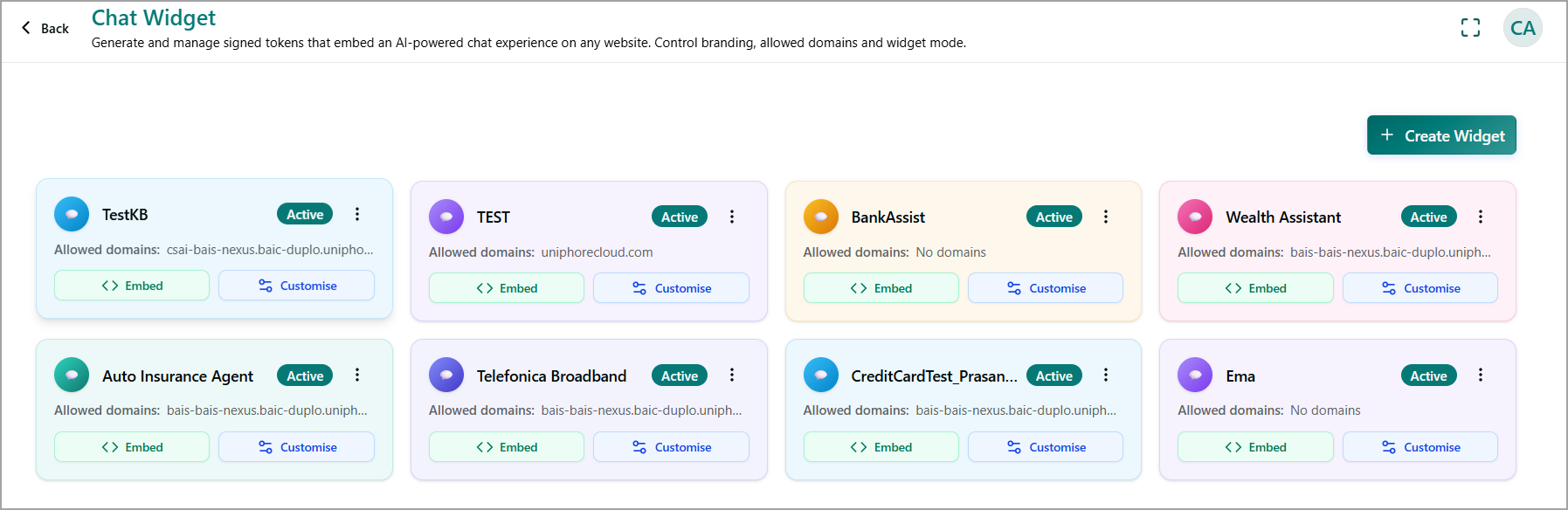
Navigate to Setup > Chat Widget to view and manage your existing chat widgets. Each widget is displayed as a card that provides the following information and actions:
Widget name - Displays the name of the chat widget.
Allowed domain(s) - Displays the domains where the widget is authorized to run. Restricting the widget to trusted domains helps prevent unauthorized websites from embedding it.
Status - Indicates whether the widget is Active.
Embed - Opens the embed options for the widget so that you can add it to your website. For more information, refer to Embed the Chat Widget on Your Website.
Customize - Opens the customization settings for the widget. For more information, refer to Customize an Existing Chat Widget.
Ellipsis
 - Provides additional actions for managing the widget. For more information, refer to Perform Additional Actions on a Chat Widget.
Create a New Chat Widget
You can create a chat widget to embed an AI-powered chat experience on your website. When creating a widget, you can associate it with a telephony agent, specify the domains where it can be embedded, and configure the welcome message, theme, timeout, and chat session behavior. A preview is displayed as you configure the widget so that you can review the customer experience before creating it.
In the Chat Widget page, click + Create Widget. The Create Widget window is displayed.
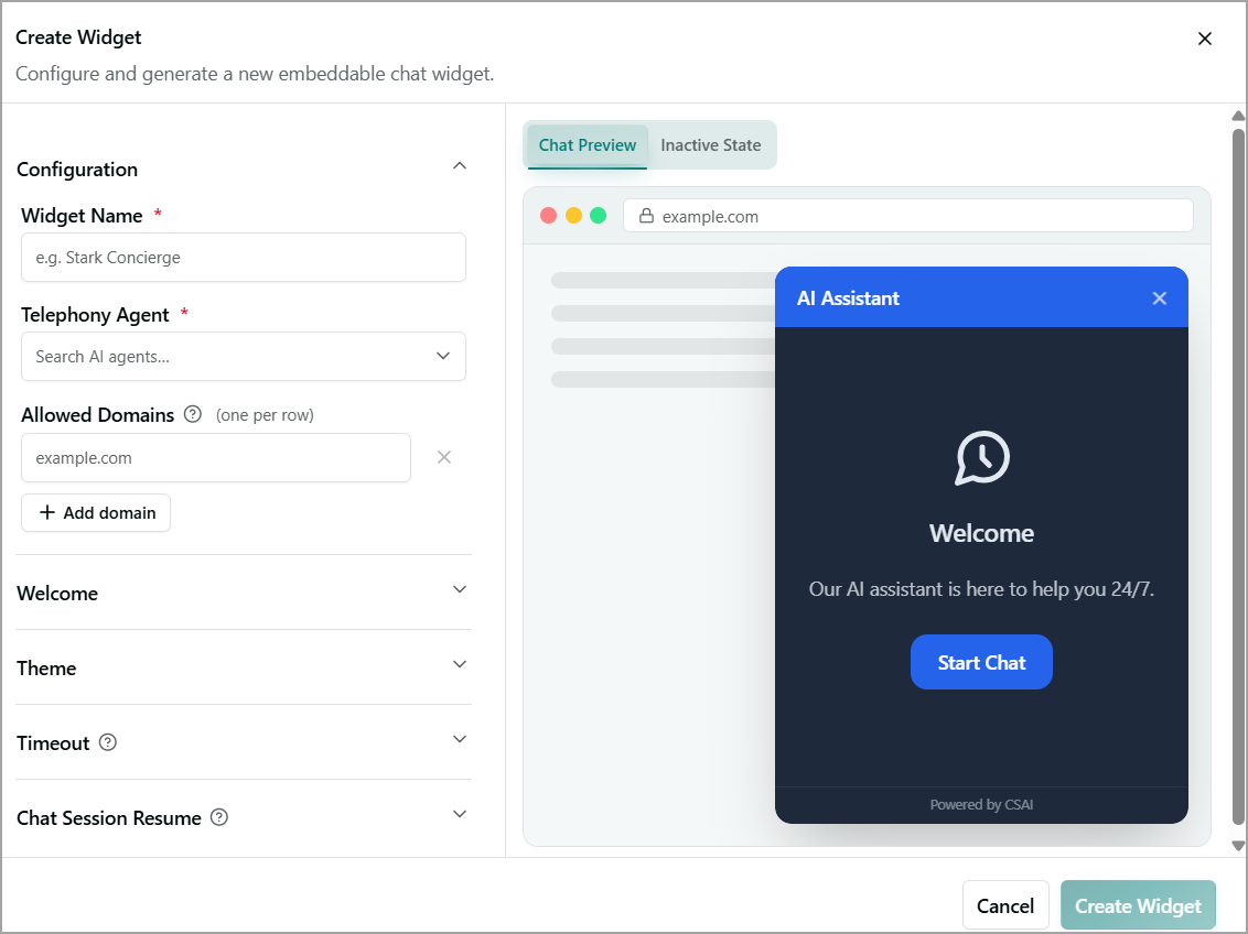
In the Configuration section, mention the following core required settings. It is expanded by default.
Widget Name - Enter a unique name for the widget.
Telephony Agent - Select the AI agent that you want to associate with the widget.
Allowed Domains - Enter the domain where you want to embed the widget.
To add another domain, click + Add domain. To remove a domain, click the Cross icon next to the domain.
In the Welcome section, configure the welcome screen that users see when they open the chat widget.
Toggle Show welcome screen to On to display a welcome screen when the chat widget loads.
(Optional) Toggle Show logo to On to display your brand logo on the welcome screen.
In the Welcome Title field, enter the heading displayed to users.
In the Welcome Body field, enter the introductory message displayed below the title.
In the Start Button Label field, enter the text displayed on the button that users click to start a chat.
In the Theme section, configure the branding, colors, and layout of the chat widget.
White Label
In the Agent Display Name field, enter the name displayed to end users as the chat agent's identity. For example, AI Assistant
In the Footer Text field, enter the text displayed at the bottom of the chat widget. For example, Powered by CSAI.
(Optional) Select the Hide CSAI branding checkbox to remove CSAI branding from the chat widget footer.
Logo
Toggle Show logo in header to On to display a logo in the widget header.
(Optional) In the Custom SVG field, paste your logo's SVG markup to use a custom logo. Leave this field blank to use the default logo. The pasted SVG is sanitized before it is rendered.
Brand Colors
Under Brand Colors, configure the widget's color scheme by using either of the following options:
Enter hexadecimal color values or select colors individually for Primary, Widget BG, Agent Bubble, Customer Bubble, and Text.
Select a Preset Theme - Modern Blue, Corporate, Fresh Green, or Dark to automatically populate all color fields.
Layout
Under Bubble Position, select where the chat bubble appears on the page: Bottom Left, Bottom Right, or Bottom Center.
Use the Border Radius slider to set the corner rounding of the widget in pixels. The default value is 12 px.
Select or clear the following display options as needed:
Show timestamps - Displays the time next to each message.
Show typing indicator - Displays an indicator when the agent is composing a response.
Animate on open - Applies an opening animation when the widget launches.
In the Timeout section, configure the session timeout and idle reminder settings.
Toggle Idle reminder to On to display a reminder message when users have been inactive.
In the Remind after (minutes) field, enter the number of idle minutes to wait before displaying the reminder.
In the Reminder message field, enter the message to display when the idle reminder is triggered.
In the Session timeout (minutes) field, enter the number of idle minutes after which the session ends.
Toggle Show "End chat" button to On to display a button that allows users to manually end the chat session.
In the Chat Session Resume section, toggle Enable session resume to On to allow users to resume a previous chat session instead of starting a new one.
Once enabled, in the Resume window (minutes) field, enter the number of minutes for which a session remains available for resumption. After this period, the session can no longer be resumed. For example, 1440 minutes (24 hours).
Preview and Finalize the Chat Widget
In the Creat Widget window, use the Chat Preview on the right to review how the configured widget will appear to end users.
Select the Chat Preview tab to view the widget in its active state. The preview reflects the configured Welcome, Theme, Timeout, and other settings, such as the header title, welcome message, Start Chat button, and footer text.
Select the Inactive State tab to preview how the widget appears before a user opens it, such as the collapsed chat bubble displayed on the page.
Review the preview to ensure that it matches your configured settings. If you need to make changes, return to the relevant sections and update the settings.
Click Create Widget to save and publish the widget with the configured settings. To cancel your activity at any time without saving changes, click Cancel.
Embed the Chat Widget on Your Website
After you create the widget, the Embed your chat widget dialog opens. The dialog displays the generated embed snippet and widget token.
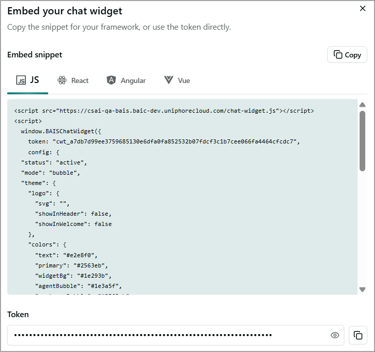
Under Embed snippet, select the tab for your framework:
JS
React
Angualr
Vue
Review the generated code snippet, which includes:
The widget script or library reference for the selected framework.
Your unique widget token.
The widget configuration object, which reflects the settings configured earlier, such as Status, Mode, Theme, and Colors.
Click Copy
 on the right side of the dialog to copy the entire embed snippet to your clipboard.
Paste the snippet into your website's HTML or the appropriate framework-specific component, depending on the selected framework.
Copy the Widget Token
If you are integrating the widget directly into your own implementation instead of using the provided embed snippet:
In the Token section, click Copy
to copy only the widget token.If needed, select the Eye icon to reveal the token before copying it.
Click Close
 in the top-right corner to close the dialog after you have copied the required snippet or token.
Customize an Existing Chat Widget
Open the widget you want to edit. The Customize Widget window is displayed.
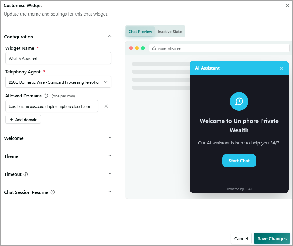
Update the widget's theme and other settings as required. For more information about widget settings, refer to Create a Chat Widget.
Click Save Changes to apply and save your updates. To cancel your activity at any time without saving changes, click Cancel.
Perform Additional Actions on a Chat Widget
Click Ellipsis
on the widget card to open the actions menu. Select one of the following actions: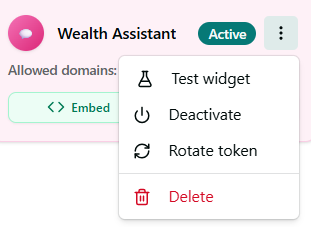
Test widget - Opens a preview of the widget so you can test its functionality.
Note
If the telephony agent associated with a widget has been deleted, the Test widget option is disabled.
Deactivate - Disables the widget and prevents it from loading on its allowed domains until it is reactivated.
Rotate token - Generates a new authentication token for the widget and invalidates the previous token.
Delete - Permanently removes the widget.